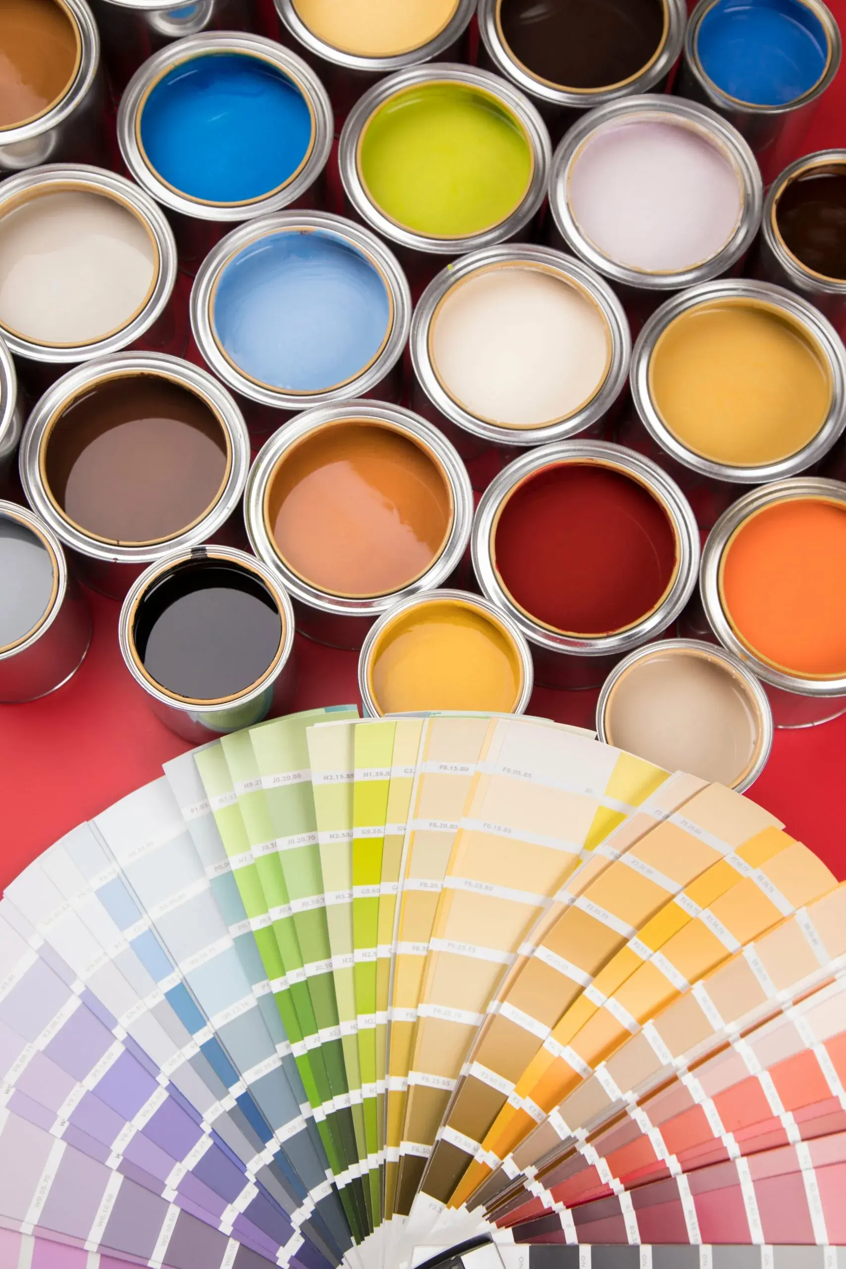
Color is one of the most powerful tools in graphic design. It evokes emotions, conveys messages and, above all, influences purchasing decisions. In Mallorca the connection to the sea and Mediterranean culture matters a lot, and choosing your brand's colors well can be the difference between being remembered or going unnoticed.
How colors work in graphic design
- Each color stirs something different: blue conveys calm and trust, yellow joy and optimism. In Mallorca, the blue of the sea and the yellow of the sun fit naturally with brands looking for that Mediterranean essence.
- On the island, colors carry their own meanings: earthy tones recall the mountains and villages, greens recall the olive and almond groves.
- If your competitors are saturating everything with blue, warm tones like orange or red also work well in the tourism context and help you avoid blending in with the rest.
A real case
A natural cosmetics brand in Mallorca could work with a palette inspired by almond trees in blossom (whites and soft pinks) with touches of green, to convey purity and a connection with nature.
Tips for choosing your brand's colors
- Research how your target audience reacts to different colors.
- Make sure the colors fit your brand's values and personality.
- Try combinations inspired by the island: the blue of the sea, the yellow of the sun, the white of the villages.
Color isn't just decoration. When I choose a palette for a client, I think about how it connects with the essence of the place where the business operates: that's what brings customers closer and makes them stay.