A serene identity for a space of integral healing.
The House of Qi · Healing Arts
The House of Qi is a healing space, with therapies adapted to each need and personalised guidance to restore health by balancing body, mind and spirit. I designed its corporate identity and took part in the development of its website.
Balancing body, mind and spirit starts with an image that also breathes calm.
Colour and identity.
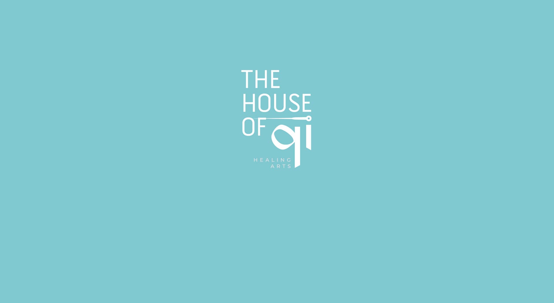
Soft turquoise and white, a serene combination that evokes the calm and wellbeing of a space for holistic therapies.
The logotype, set in a light lowercase typeface, includes an Asian character as a nod to the East-rooted healing practices worked on at the centre, in line with the brand's holistic character.
An identity that conveys calm at first glance
I chose a light lowercase typeface and a palette reduced to turquoise and white so the brand would convey calm even before you got to know the centre's services.
A website designed to accompany, not just inform
I took part in developing the centre's website, keeping the same serene palette and a simple structure that helps explain the therapies without feeling clinical or cold.
The House of Qi now has a serene identity coherent with its integral healing offering.
This project is part of my brand identity services.