
An identity as precise as the blueprints it signs.
AB Estudio · Architecture, Palma de Mallorca
Corporate identity design for AB Estudio, an architecture firm in Palma de Mallorca founded in 2005 by architect Daniel Aleix. A team of technicians devoted to tailoring a solution for each project, who needed a brand equal to that care.
Every line of the brand, as measured as a construction drawing.
Colour and identity.
Neutral greys and blacks that recall the technical pencil and the architectural plan, with a clean, professional finish befitting an architecture studio.
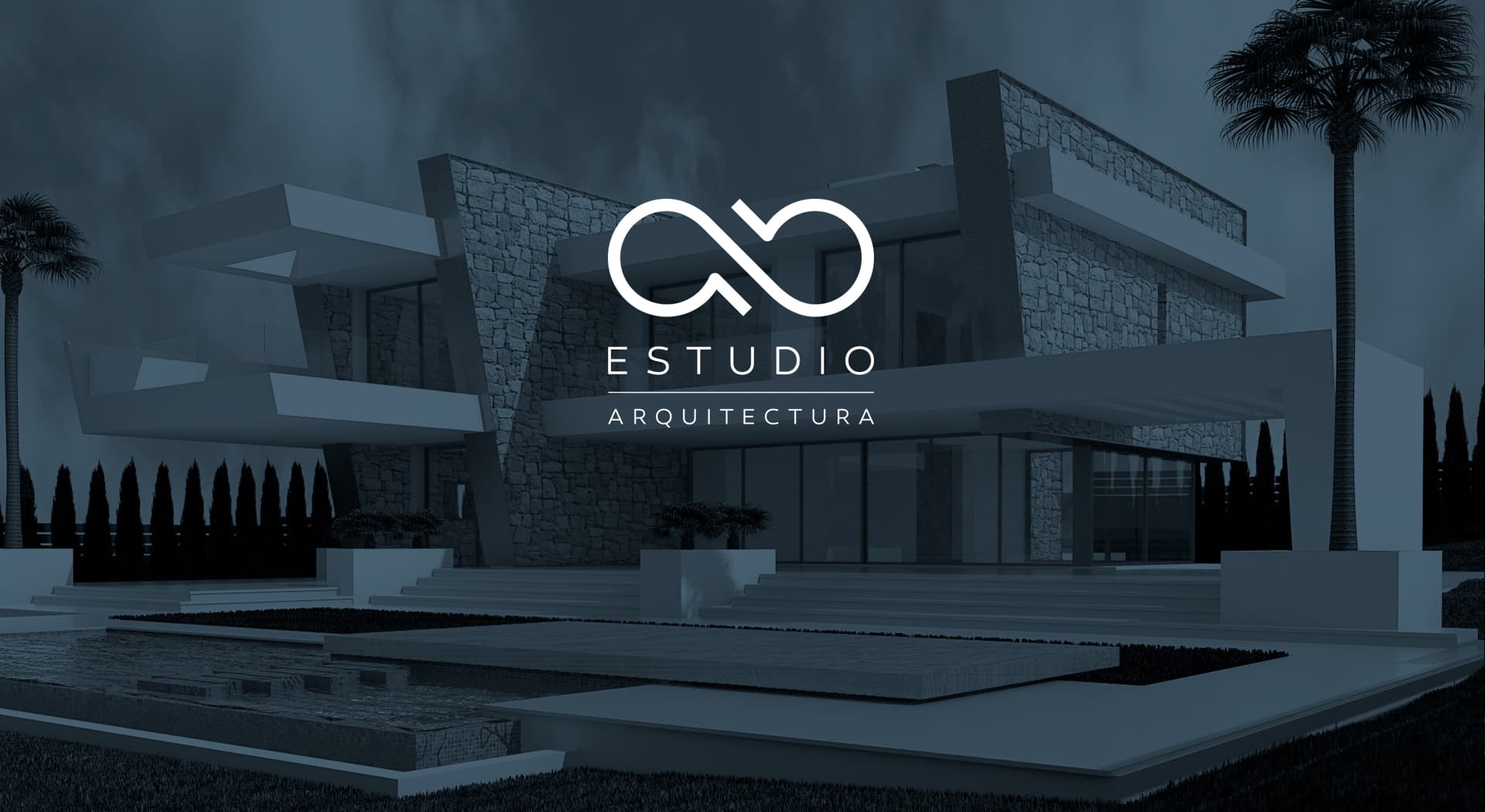
The logotype distills the initials AB into a firm, geometric construction, with careful proportions that bring to paper the same technical rigor the studio applies to every architecture project.
The AB monogram
I built a symbol from the studio's initials, with straight strokes and clean angles that speak the language of contemporary architecture.
Stationery and digital presence
I extended the identity to the studio's stationery and website, keeping the same sobriety so the brand works as well in a project dossier as it does on screen.
AB Estudio now has a sober, technical identity that reinforces its positioning as a serious, meticulous architecture firm in Palma de Mallorca.
This project is part of my brand identity services.