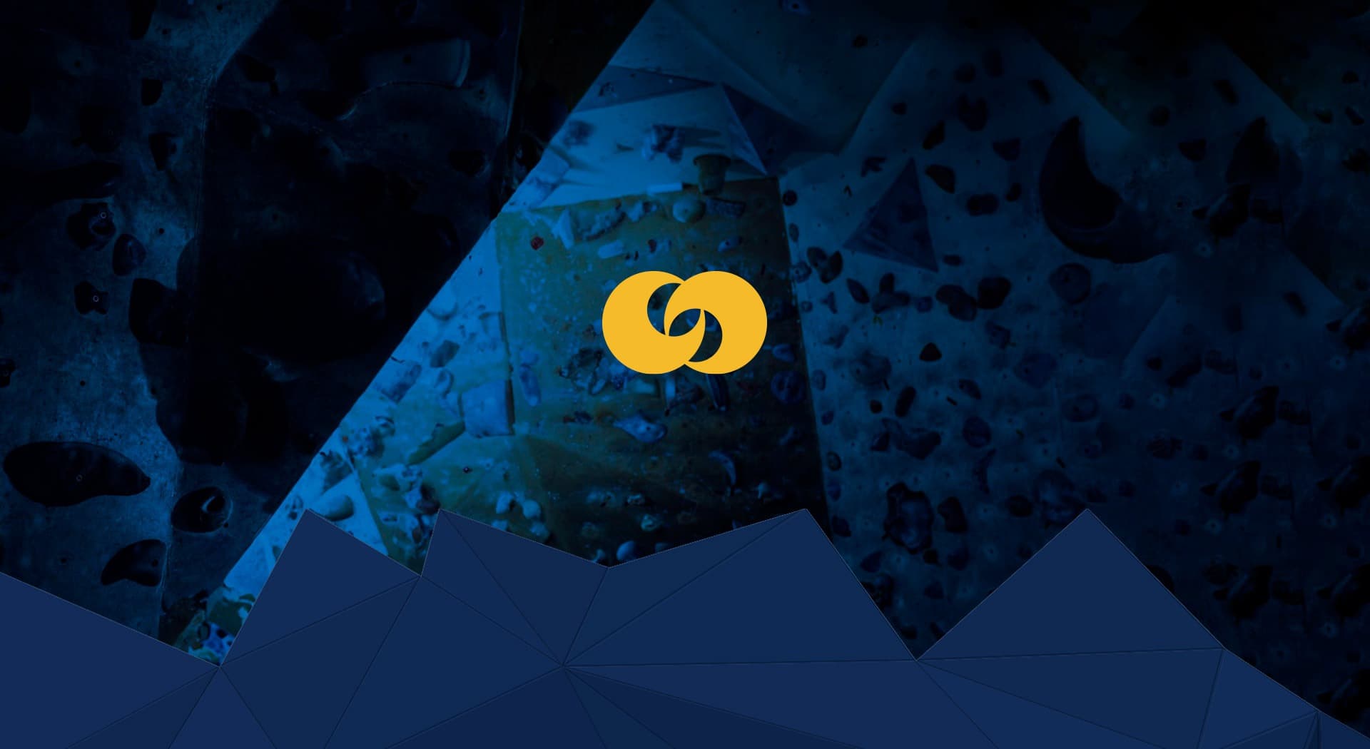
Climbing holds turned into a symbol of strength for a climbing gym.
In-Rock · Climbing Gym
In-Rock is a climbing gym that needed an identity as tough as its own climbers. I developed a logo with a robust typeface and a symbol built from climbing wall holds.
A climber's strength and endurance, made into a brand.
Colour and identity.
Yellow, conveying energy, combined with navy blue, which brings trust and stability.
The symbol is built from coloured climbing holds, integrated into a robust typeface that evokes the strength and endurance that characterise those who practise this sport.
Holds as a symbol
The climbing wall's own holds become the brand's distinctive graphic element, a direct nod to the gym's activity.
A website to explore and book
Beyond the branding, I developed a modern website where users can learn about the facilities, find out about the services and book their climbing sessions.
In-Rock has a modern identity and website that convey the energy of climbing, from the logo to booking sessions online.
This project is part of my brand identity services.