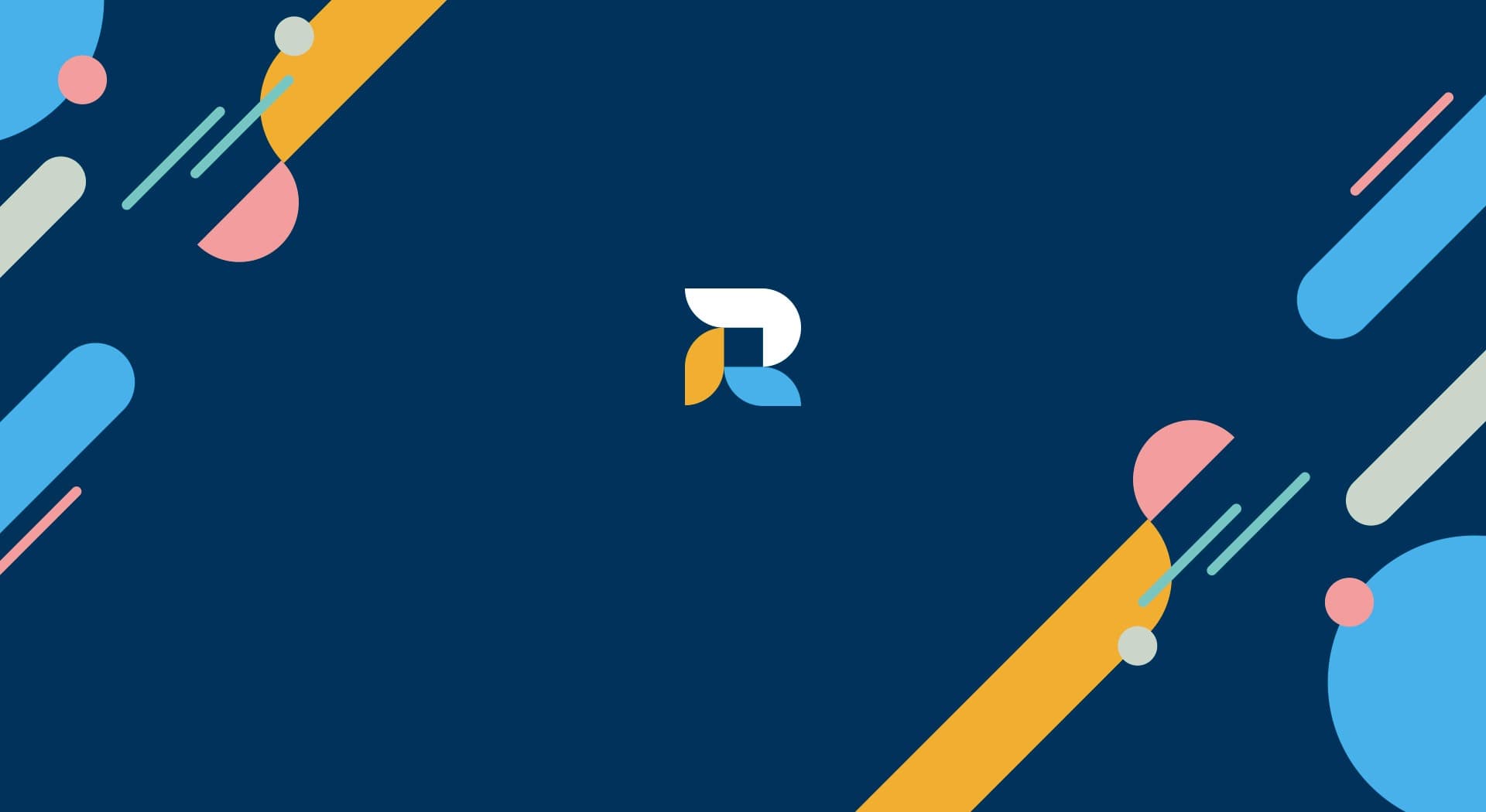
An R built from blocks for a versatile construction company.
ROD Grup · Renovation and construction
ROD Grup specialises in managing renovation and construction projects across very diverse sectors: health and education facilities, commercial and industrial projects, homes, detached houses and pools. I designed its brand and developed its website to convey that versatility.
Every block adds solidity to the structure of a brand.
Colour and identity.
Navy blue combined with touches of orange and sky blue, a palette that blends professionalism and creativity in equal parts.
The logo's symbol is an R built from blocks, symbolising the company's solidity and structure, paired with condensed uppercase typography that adds a modern, elegant touch.
An R that builds solidity
I built the brand's symbol from blocks that form the letter R, carrying into the identity the same solidity and structure that ROD Grup applies in its construction and renovation projects.
A website to explore all its business areas
I developed a website with Home, About us, Business areas (new builds, refurbishment and renovation, and pool construction), Projects and Contact sections, making it easy to explore the full portfolio.
ROD Grup now has an identity and a website that convey the solidity and versatility of its renovation and construction projects.
This project is part of my brand identity services.